
The well-known Essie polish “Shine of the Times” is a holographic flakie topper, and rather hard to find for a decent price. A few weeks ago I was a mad woman searching multiple sites and saw it for as much as $20, but luckily found it in a package deal from Ebay. Was it worth it? Absolutely. Every time I look at my hand from another angle, I noticed more color shifts and fell in love with it even more. Now yesterday, I walk into 5 Below, and notice what I think to be a very similar polish by Fresh Paints. I picked it up and decided to compare.
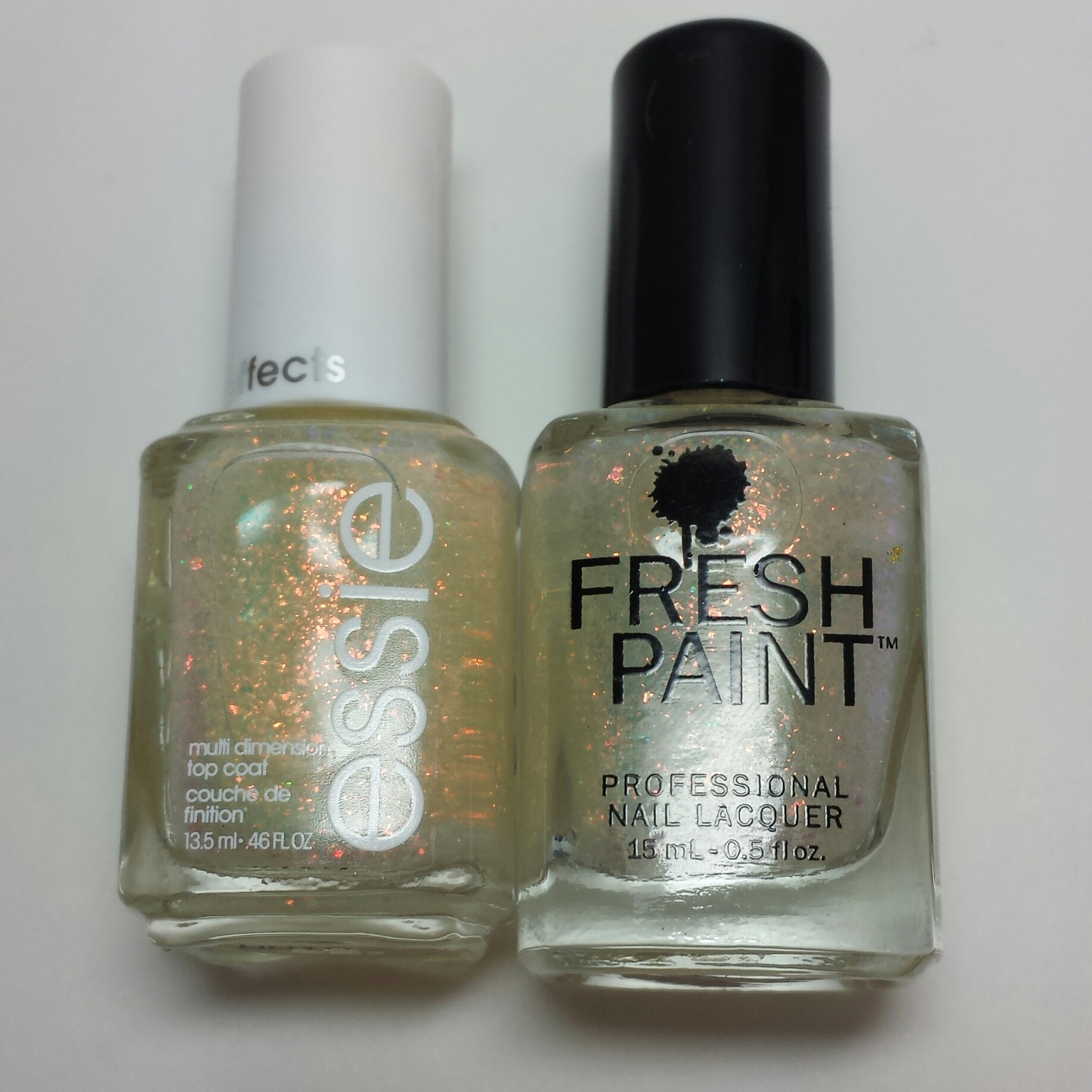
They looked a tiny bit different in the bottles, as the Essie looks a bit more gold toned. But, I know better than to solely judge by the bottle so I decided to put them on my nails right next to each other!
My base color for my comparison was 2 coats of Essie Parka Perfect:

For my comparison, I used SOTT on my pointer and middle finger and Sugar Crush on my ring and pinky. Here’s what it looks like with one coat of each:

Honestly, I couldn’t see ANY difference. I wanted to see if another coat would bring out a more drastic effect in either one so here it is with two coats of each:

It is a perfect match. Again, Shine of the Times is on my pointer and middle finger and Sugar Crush is on my ring and pinky. And for $2 for a single bottle and $5 for three, I’m going to go back and get some more just to stock up. This topper changes any regular color into a real stunner!
